

Self Portrait in Monotone/Duotone/Tritone
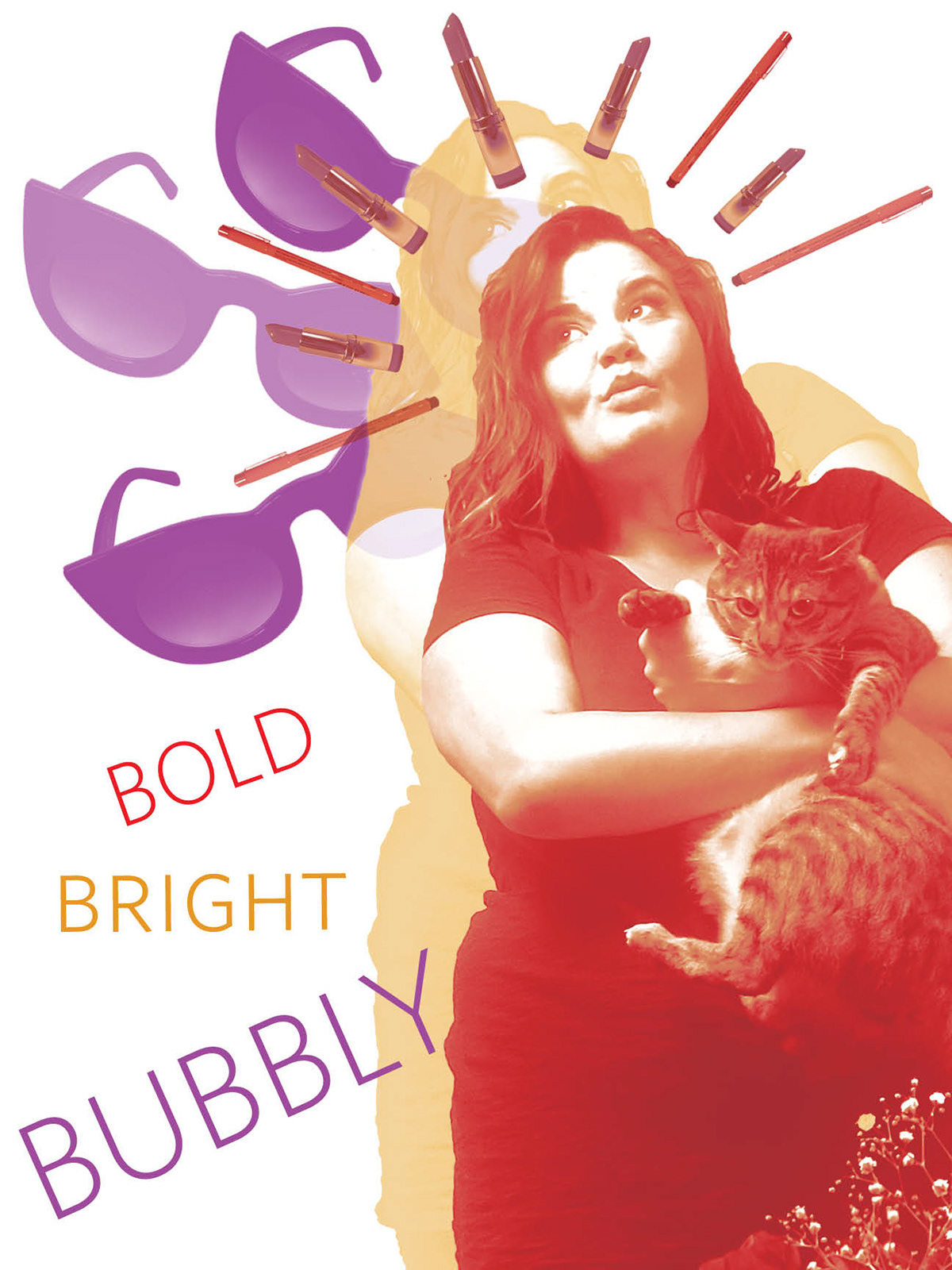
The purpose of this portrait project was to learn about monotone, duotone, and tritone color processes, as well as the differences between CMYK and RGB in digital and print material (due to these differences, of course my initial print came out WAY muddier than I would have liked, so I went back and made adjustments). We were asked to include several objects that we used on a daily basis, as well as three adjectives about ourselves, all in various combinations of mono/duo/tritone.
To that end, I chose fuchsia, yellow, and red, then played with their levels until I liked what I had. The words, sunglasses, and background portrait are monotone, the lipsticks are duotone, and the pens and front-most portrait are tritone. I used multiply to add transparency to some of the sunglasses, the pens, and the yellow portrait.
The picture of me with my cat reminded me of some religious iconography, so I took a tongue-in-cheek approach to the placement of my objects, forming a sort of halo with the pens and lipsticks.
Originally, I also had words over my face and interspersed with the objects, but post-critique decided to remove them for a cleaner look.


The original shot, and various process photos in monotone, duotone, and tritone.


